Visual Adjustment
Components
Custom PayU Payment Method Selector with Chosen Method

Selector components:
- 1. payu_styles_textStyleHeader (main name of selected Payment Method)
- 2. payu_styles_textStyleDescription (secondary information, for example: card Number)
- 3. payu_styles_accentColor is used for background
Custom Merchant Style for Select Payment Method (with Google Pay Configured)
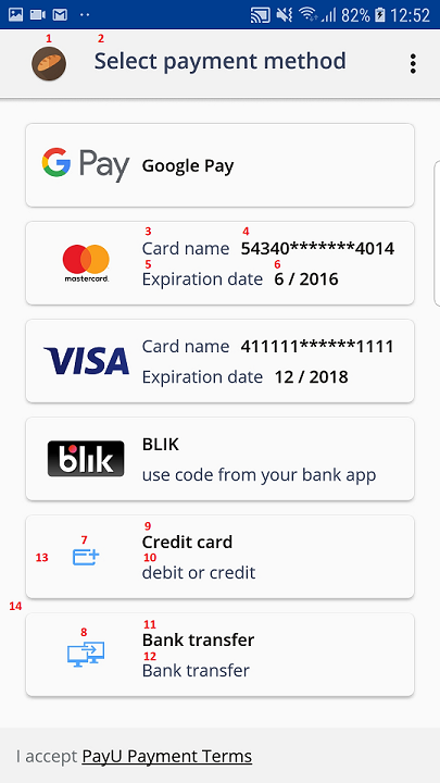
Select Payment Method Chooser components:
- 1. Toolbar icon can be changed to display different image
- 2. Toolbar text has style payu_styles_textStyleTitle
- 3, 5, 10, 12. This textView uses style: payu_styles_textStyleDescription
- 4, 6, 9, 11. This textView uses style: payu_styles_textStyleHeadline
- 7. Card icon can be changed to display different image
- 8. Bank icon can be changed to display different image
- 13. Adding new card can be turned off please check XML Properties in this module
- 14. You may also change the color of background with using color: payu_styles_backgroundColor - default color is #FCFCFC
To Items we are applying payu_styles_textStyleButtonBasic.
Custom Merchant Style for the Add Card Module
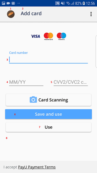
Add Card Module components:
- 1. Toolbar icon can be changed to display different image
- 2. Toolbar text has style payu_styles_textStyleTitle
- 3, 4, 5. **payu_styles_textStyleInput (textColor & textSize ) with payu_styles_windowContentPadding propeties set , default style changes that depends on Android Platform API to TextInputEditText will be automatically integrated by Android
- 6. If "save and use" button is not disabled by configuration this button use payu_styles_textStyleButtonPrimary
- 7. If "save and use" button is not disabled by configuration this button use payu_styles_textStyleButtonBasic in other case: payu_styles_textStyleButtonPrimary
- 8. Background property: payu_styles_backgroundColor with use of padding payu_styles_windowContentPadding
Custom CVV Dialog Box
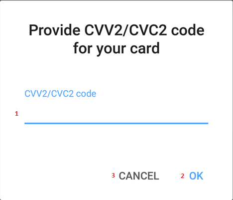
CVV Dialog box components:
- 1. **payu_styles_textStyleInput (textColor & textSize )
- 2. possitive color is taken from: payu_styles_accentColor
- 3. negative color is an alpha from textColor
Custom Merchant Style for PBL Chooser Screen
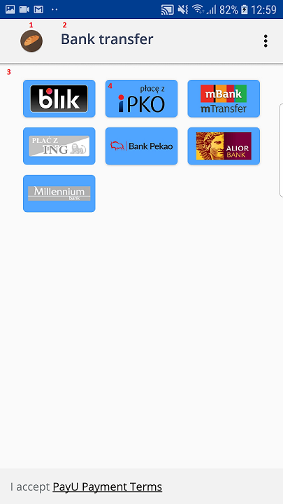
PBL chooser components:
- 1. Toolbar icon can be changed to display different image
- 2. Toolbar text has style payu_styles_textStyleTitle
- 3. Background property: payu_styles_backgroundColor with use of padding payu_styles_windowContentPadding
- 4. To Items we are applying payu_styles_textStyleButtonBasic
Custom Merchatn Style for About Screen
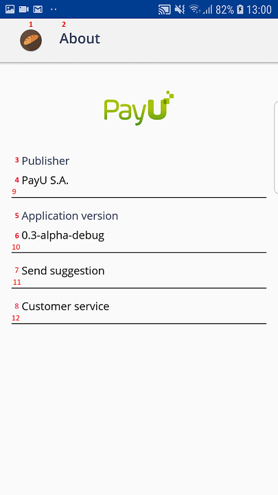
About screen components:
- 1. Toolbar icon can be changed to display different image to know more check sample code section in General Configuration
- 2. Toolbar text has style payu_styles_textStyleTitle
- 3, 5. This textView uses style: payu_styles_textStyleDescription
- 4, 6, 7, 8. This textView uses style: payu_styles_textStyleText
- 9, 10, 11, 12. Separators use color: payu_styles_separatorColor - default is #906f7476
You may also change the color of background with using color: payu_styles_backgroundColor - default color is #FCFCFC.
Style Configuration
Each module can be configured to utilize defined by merchants branding: Colors, fonts, paddings and other xml properties. To change styles you should create class that extends abstract class BaseStyleConfiguration. There are four methods that can be overrided:
| Method Name | Description |
|---|---|
pathIconPBLPayment() | Provided path to resource in res/drawable/ file, the icon will be displayed in PayByLinkButton in payment-library-chooser-module. |
pathIconAddNewCard() | Provided path to resource in res/drawable/ file, the icon will be displayed in AddNewCardButton in payment-library-chooser-module. |
payuLibraryIcon() | Provided drawable will be used as library icon visible in toolbar in all modules |
PayuStyle() | Provided style should extends: @style/Theme.PayU.Fronts. |
XML Configuration for Functions in SDK
Create XML file name payu.xml (in res/values/ directory).
Created Style class should be provided to SDK, (if this won't be done fronts sdk will be using default colors). To provide class please add new string to resource file:
<string name="payu_style_class_fully_qualified_name">packageName.ClassName</string>
for example:
<string name="payu_style_class_fully_qualified_name">com.payu.android.front.sdk.config.MerchantStyle</string>
To utilize new style you should extend yours style from Theme.PayU.Fronts in styles.xml file.
<style name="MerchantStyle" parent="Theme.PayU.Fronts">
    <item name="payu_styles_toolbarColor">@color/background_toolbar</item>
    <item name="payu_styles_backgroundColor">@color/background_main</item>
    <item name="payu_styles_separatorColor">@color/background_item</item>
    <item name="payu_styles_primaryColor">@color/colorPrimary</item>
    <item name="payu_styles_accentColor">@color/colorAccent</item>
    <item name="payu_styles_windowContentPadding">15dp</item>
</style>
Below you can find properties of base style that can be changed:
- payu_styles_backgroundColor,
- payu_styles_toolbarColor,
- payu_styles_separatorColor,
- payu_styles_fontColor,
- payu_styles_primaryColor,
- payu_styles_accentColor,
- payu_styles_windowContentPadding,
- payu_styles_textStyleButtonBasic,
- payu_styles_textStyleButtonPrimary,
- payu_styles_textStyleTitle,
- payu_styles_textStyleHeader,
- payu_styles_textStyleHeadline,
- payu_styles_textStyleDescription,
- payu_styles_textStyleText,
- payu_styles_textStyleInput.
Widget Styles
If there is a need you may configure 8 widgets styles that and can be divided in 3 categories: text (title, header, headeline, description, text), button (buttonBasic and buttonPrimary) and inputText (input).
Text Styles
Text properites (title, header, headeline, description, text) extendsStyle.PayU.Fronts.Text with additional properties fromTheme.PayU.Fronts:
- payu_styles_textColor,
- payu_styles_textSize,
- payu_styles_font,
- payu_styles_paddingBottom,
- payu_styles_paddingTop,
- payu_styles_paddingLeft,
- payu_styles_paddingRight.
To configure Title style please extend your style by TextAppearance.PayU.PrimaryHeaderText and add reference to it in payu_styles_textStyleTitle tag in Theme.PayU.Fronts.
For configuration of Header Style please extends your style by TextAppearance.PayU.SecondaryHeaderText and add reference in payu_styles_textStyleHeader tag.
To utilize Description please extends style by Style.PayU.Fronts.DescriptionText and put a reference to it in payu_styles_textStyleDescription tag.
To utilize Headline please extends style by Style.PayU.Fronts.HeadlineText and put a reference to it in payu_styles_textStyleHeadline tag.
To utilize Text please extends style by Style.PayU.Fronts.NormalText and put a reference to it in payu_styles_textStyleText tag.
Button Styles
Button has two predefined styles: buttonBasic, buttonPrimary.
ButtonBasic extends Style.PayU.Fronts.Text and has additional property:
- payu_styles_buttonBackgroundColor
to configure it please extend TextAppearance.PayU.Button and put reference to it in payu_styles_textStyleButtonBasic.
ButtonPrimary extends buttonBasic, to utlizie it please extend TextAppearance.PayU.Button.Primary and set reference in field: payu_styles_text StyleButtonPrimary.
Input Text
Last one is style TextAppearance.PayU.EditText that extends Style.PayU.Fronts.Text.
Footer Terms & Conditions PayU
To Add PayU Footer with Terms & Condition custom layout please include:
<com.payu.android.front.sdk.payment_library_core_android.conditions_view.PayUTermView
    android:layout_width="match_parent"
    android:layout_height="wrap_content"
/>
This layout is not customizable via Theme.PayU.Fronts style.